
I’ve just added some fabulous blue and white antique platters that I picked up in London (for such a deal) to my black and white living room. It was pretty daring for me. I usually either love something right away or hate it, so I was wondering what would happen. Love it? Hate it? With this addition, I’m just not sure----so, for now they’re staying.
When I left the Haymarket Hotel I had so many ideas of grandeur. Kit uses fabric in the most amazing ways. Certain walls are covered in luxurious fabrics and the pattern is repeated on accent furnishing. For me to even consider attempting this is a huge leap and one that I’m still not sure I’ll take (the blue platter were quite the leap). But, even my contemplation of stepping out of my comfort zone makes me excited. "I think I can, I think I can, I think I can…. (I'll let you know if I try!).
The artwork in Haymarket left me awestruck. When you walk into the front lobby there is a massive black and white oil painting --- that actually took my breath away. It was done by a local London artist named Robert Virtue. The use of such a large piece in a moderate sized space works and pulls the entire room together.
In all of the rooms, lighting takes on such a place of importance. Everywhere you look you see pendant fixtures, sconces, and table lamps. In each room you’ll see contrasting elements; vintage and modern, black and yellow, wood and metal, shiny and dull, bold and subtle. One thing I know for sure is that Kit is not afraid to experiment or take chances --- and it always works.


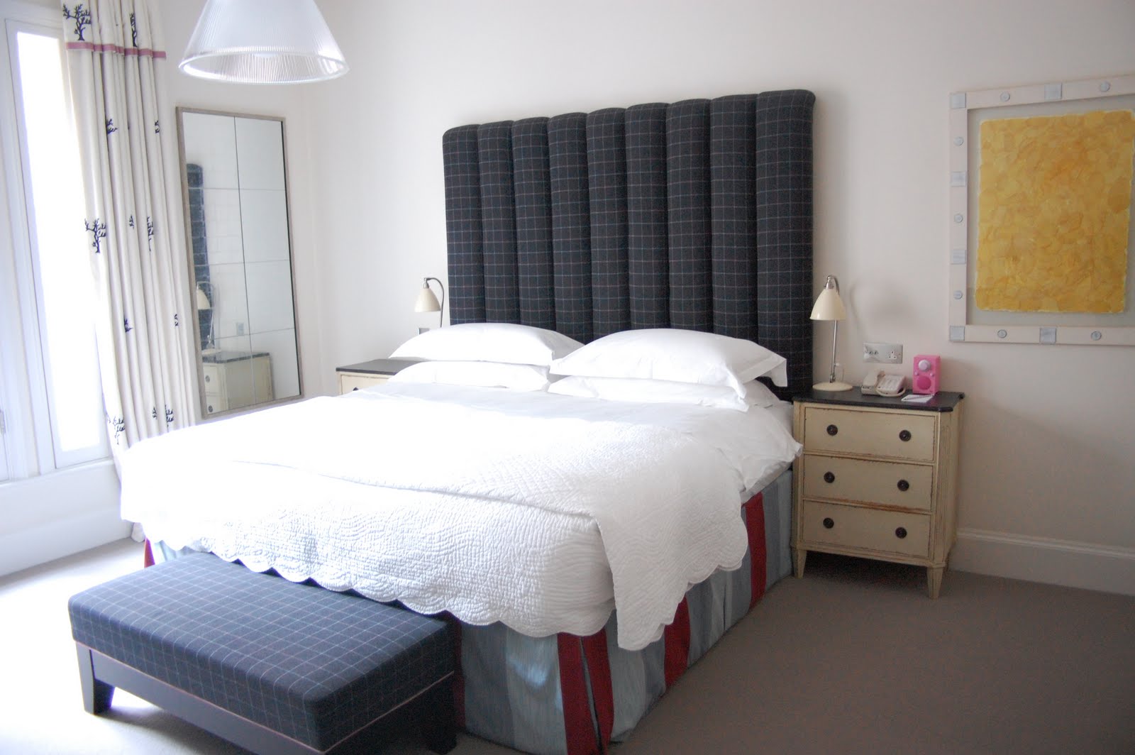
 The two last pictures are of my living room that i've tried to jazz up a bit....
7 comments:
Kelly - love the platters and framed letters? in the last shot - wow lots of colour in the Haymarket....some too much but as a big fan of colour myself....it's inspiring...good luck infusing more color into your home
Those are some pretty adventurous spaces!! Some are a little scary for me. That black and white painting really caught my eye too. It's got the power of a Franz Kline. And I love the sculpture that echos the shapes in the painting when everything else is so linear.
I LOVE those blue plates in general but I have to say I'm a little indifferent to them there. And I don't think it's a color issue. My initial feeling is the pattern of all of the pieces (the other plates and the letters) in that one grouping are all too much the same size.
Wow, that is serious BOLDNESS! I adore the first room and I am so in love with that painting. The one room (number 7) has the coolest wall. Is it painted in that pink fade effect or achieved by the lighting? I'm assuming the lighting because it effects the door a bit but I'm not sure. I really like your addition of the blue platters. I think it's an interesting juxtaposition of of color and shape.
Meat platters in the living room! (But I covet the pale one in the centre.) Do you know their history? Take a peek at my blue onion platter in my blog.
Wow Kelly, the Haymarket Hotel looks amazing!!
I love your blue platters on the wall & can't wait to see what else you have been up to:) Wishing you a lovely week as always ~ Tina x
Love the photography and the design of each room.. It’s sophisticated finishes give it that timeless feel. But the metallic strokes make it radiant! The feeling is luxe!each room is bathed in natural light yet elegant! can't wait to see yours and read your article. thanks for sharing.love your post.
AMAZING use of colour - so light and airy and spacious that they take it well. It's funny, I'm originally from London and thought I knew it like the back of my hand, but I've never visited the Haymarket hotel. Thanks for the tip - I'll make a special trip now! xx p.s. I LOVE your taste in music!
Post a Comment