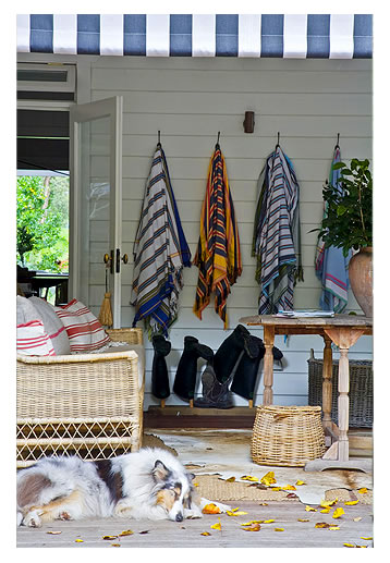
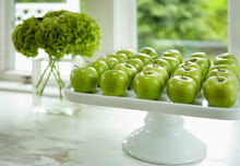
May-June 2010 issue of Inside-out Magazine/ Australia features the home of designer Greg Mellor and his partner, Nick Krull. Their home, their stlye, their ideas are amazing. Contrast of light and dark abound. Texture is everywhere. I can't stop looking at their lighting, accessories and artwork . Greg and Nick's story about the entire renovation is awesome and inspiring. These tear sheets will be on my inspiration board for a long time. Unfortunately, these were the only images that I could copy and paste. Check out Greg Mellor's website for more amazing images.http://www.gregorymellor.com/
Gregory's Tips
• There are no set rules in terms of style; in fact I believe a room is made more interesting by mixing styles and using disparate references. However, the elements do need to work together and not compete, and there should be a thread of consistency between rooms to avoid a home becoming a theme park.
• Proportion is of the utmost importance, and keeping proportions correct. One can play with proportions to add interest to a room, however it must make sense and not appear as if it is a mistake.
• Keep the room classic and as timeless as possible, and then accessorise. Decoration can be changed easily to keep a room up-to-date. This will help the longevity of the design and avoiding the use of gimmicky fads that are so often overdone.
• If there is a concept - it should be done with an attitude. There is nothing less convincing than something half-baked or apologetic.
• Collections help show personality in a room, whether it be old trophies, books, antiques - even garden implements. It is fun to start a collection and Salvos Stores is the perfect place to start sourcing and adding to your collection. Therefore always be on the lookout for another piece to add to it when shopping.
• Never be afraid to mix old and new, it layers a room, which makes it look quirky and lived in.
• A pair of large-scale glass vases could make great table lamps - often using objects in a different context to their original function helps an interior maintain uniqueness and avoids the ‘cookie cutter' look.
• Don't be afraid of using bold colour. If you see a piece that might be the correct proportion but it is in a dull brown veneer - imagine it in a glossy black or red lacquer- it might be perfect.
• When looking for books to fill bookcases, check below the dustcover. Often tattered and stained dustcovers can be off putting, but the linen beneath is fine. Alternatively, cover a large collection of old books in shiny white (or coloured) paper for a quick update to a bookcase.
• Salvos Stores are also some of the best best places to look for old baskets - again this could be for a collection, and baskets are very effective accessories.
Subscribe to:
Post Comments (Atom)


5 comments:
loved those images and great advice as well. thanks.
I like the idea of the books make over for the shelves and also the large glass vase idea. Both good points about make the room jump.
I could happily walk into those interiors and live in those rooms. Sometimes though, its hard to put it together yourself.
My company has that property for sale! www.belleproperty.com.au
property ID 1397315
Oh how fabulous to see an Aussie mag and home featured here Kellie:) The home is gorgeous, I have to agree! Hope you are having a wonderful weekend:) Hugs ~ Tina xx
Sorry KellY..:( I really do know how to spell your lovely name. Happy weekend again ~ Tina xx
Post a Comment