In the February 2011 House Beautiful ,they feature a one day living room makeover. The house is located in Westport, Connecticut and the owner is a young, beautiful retail executive. The very talented Healing Barsanti http://www.hbhomedesign.com/ orchestrated the makeover. By now, most of you know that I’m a “less is more” gal and I’m all about neutral….with punches of color and lots of texture. I’m also not one for dissing anyone’s work or dissing anyone…I hate conflict. But, I can’t help but think that there is WAY too much going on in this space…The rug…I’m not a fan, is WAY too busy. The hardwood floors in this space are gorgeous….The purple….I’m not a fan of this either(with the blue) and the art work on the mantle….To me, and it’s just my opinion, there is too much pattern in this space and just too much…I do love the furniture placement , if you check out Healing Barsanti’s website , they have amazing beautiful spaces that really pull together a room…I’m just not sure about this one..

Image 2: Before
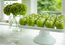
First three images from House Beautiful , photography by Francesco Lagnese. Last image from Healing Barsanti's website


21 comments:
I love color but I agree, it's too much for me. I prefer neutrals with a touch of blue and a pop of red. Purples and blues and all the crazy patterns just isn't soothing to me or invigorating (just gives me a headache). Keep doing what you do; I prefer it for ideas.
I think you're right - I much prefer the house before the decorator got their hands on it!
Totally agree...way too much pattern
As a disciple of the Kelly McGuill School, of course I agree. The result is a much better use of space but I'll bet the furniture is compressed toward the sofa for the photo shoot. It seem impossible to negotiate this room.
All the last room needs is a big bowl of granny smith apples.
As a professional Interior Designer, I don't like to put down other designers, but I have to say, that it seems a little busy. It gets a little loud and overwhelming with that much pattern. It may seem a little better in person, sometimes furniture is compressed for photo shoots, and pillows and accessories are moved into unatural positions. I do like the furniture layout though. More importantly, it's all about the client. Do they like it? That's what our goal is supposed to be.
Susan : )
I love the purple, but prefer the seagrass rug and baskets in the before, the after does seem too much. It was more tranquil before.
It just doesn't quite gel, it's not well put together at all, it needs to be pared down, with that purple lamp the first to go IMHO.
I prefer the look in the before, as well. Way too much happening in the after for me, but hopefully it is what the homeowners wanted.
I'm so glad to hear someone else had this reaction as well. I actually prefer the before to the after. The tie-dye rug just kills me. Furniture placement good - color and pattern choices.....hmmmm
Melissa
hi kelly,
i just got back from vegas and see this post and i'm like yay!
i totally agree with you. the before was WAY better. the after looks like a bad experiment. sorry but that's what it looks like to me. the only thing missing in the before pic is a white plate with green apples.
xo
janet
I was just looking at that again, in the mag, this am. And I swear...it is migraine inducing to me. The colors the STUFF. Just off. But do agree that it probably is qyuite different in real life. Better different....hopefully.
Wow! There does seem to be a big difference between the last image and the first two. I wouldn't suspect that the same designer did both spaces. I wonder if the client has a passion for pattern. I do agree about the rug because I think I would be able to see the room more clearly if it weren't so busy.
Great post and thanks for sharing your thoughts!
Kelle
xx
holy moly!
I like the before look so much better. The after pictures make my head spin. I would never feel calm and relaxed in that space.
Very interesting...
I like both, but probably would prefer to live in the more sparsely decorated space.
I saved that spread to show my clients, to ask them which page they would prefer to live in, because it's a great visual to help determine their decorating preferences.
Also, I've noticed that when taking photos, the camera seems to make things look more sparse than they are in real life. So to me, what looks like a good balance of "stuff" in real life, looks slightly more sparse in photos.
Given that, imagine how busy the second version is in real life...
The "before" look is much simple and elegant than the "after". Love it.
I really, really appreciate being on your blog list....I always get so many people clicking over to my blog from here......
just wanted to say thanks!!!
And, I always look forward to your posts!
Absolutely agree. Right now, I am so into making a home that is simple and calming and I, too, find that in many of these magazine spreads and home design TV shows that I like the 'before' with it's simplicity and less eye 'clutter' so much better. It seems that many of these designers are missing the vibe of so many of us right now to simplify. Great post.
I thought the same thing when I saw those pictures. I totally agree w/you.
You know sometimes when I see a space in a magazine and I think...hmmmmmm...not so much...I always think "well...what do I know". To each his own. But I was shocked by this space and I do not think they should call it "one day" cause as a designer...I know it wasn't.
I knew I loved you!
I thought all the same things...
so glad you shared that last picture. redeeming!
-{darlene}
fieldstonehilldesign.com
My thoughts exactly when first seeing the story in the printed issue, I MUCH prefer the "before". As a nonprofessional, it is comforting to learn that I'm not out-of-step with the entire design world.
Post a Comment